A brand identity for a Clio Award-winning creative leader who cares about animals and authoring great narratives.
Amanda wanted to create a digital garden that blooms with her professional achievements as a seasoned copywriter and creative lead and showcases her diverse body of work, spanning impactful campaigns, compelling articles, and memorable events.
With a palette of vivid blues, lush greens, and vintage, approachable typography, our objective was to cultivate an inviting and engaging portfolio website that reflects her career’s growth and demonstrates her profound impact as a storyteller and creative force.
Brand Identity Design & Development, Brand Guidelines, Website Design, Web Admin
2025 - Present
Inspiration
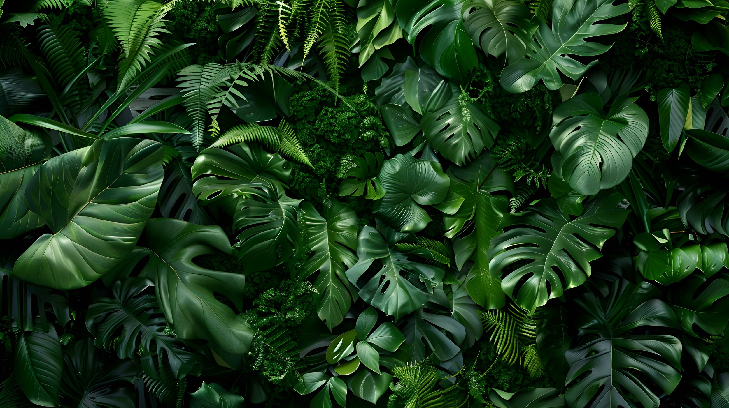
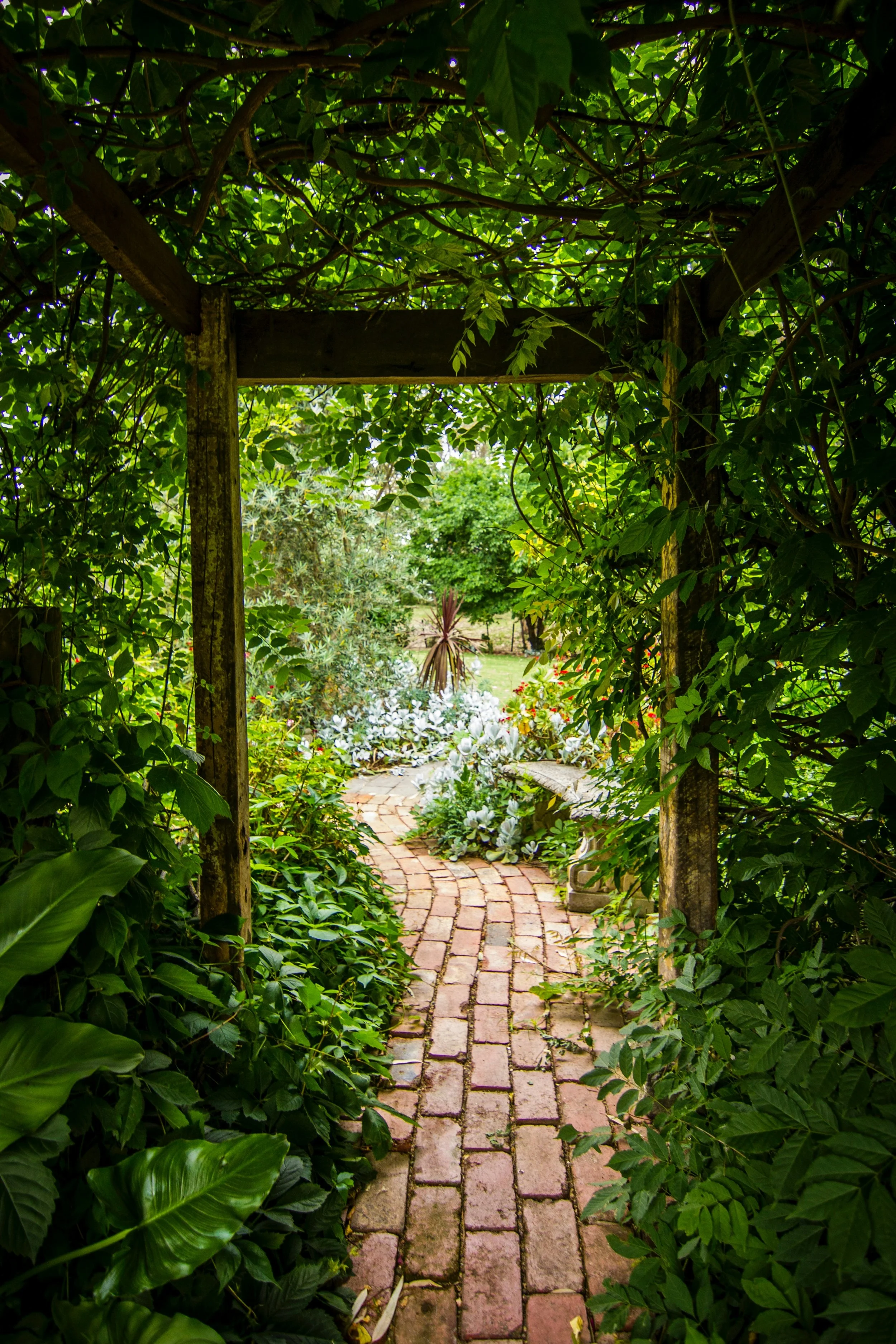
Inspired by her last name and deep love for animals and the outdoors, the visual direction for Amanda’s brand draws heavily from nature. This nature-first approach also reflects the way she approaches storytelling: with curiosity, warmth, and a reverence for the details. Lush greenery, cozy cottages, and quiet moments create a tone that feels fertile, honest, thoughtful, and deeply connected to the natural world.


Branding
Amanda shared a clear creative direction rooted in balance, approachability, and versatility: “My favorite colors are blue and green, and I want a clean, welcoming look. Nothing overly black/white, but not too girly either. I have a lot of B2C work samples, but I also want to be able to include B2B examples without them feeling out of place.”
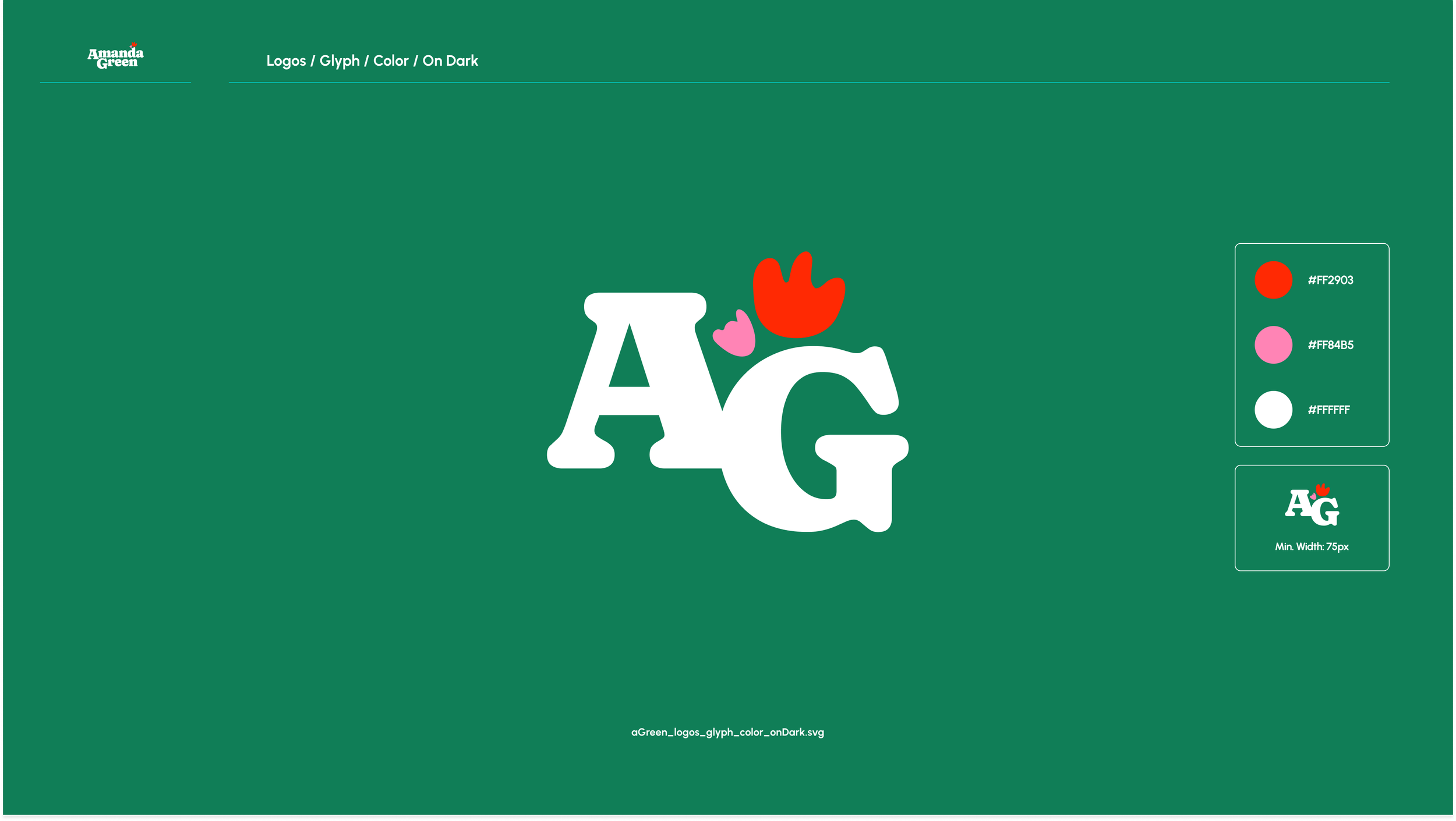
To create a timeless and rooted brand, we leaned into vintage typography to avoid fleeting trends in favor of something with lasting character. We chose Caprasimo for her logo: a serif font with expressive curves and an old-world charm that pairs beautifully with her thoughtful, literary voice.
A custom mark transforms the “D” in her first name into a vase, cradling abstract floral forms. A soft animation brings the flowers to life. Subtly blooming on load, the forms help evoke the feeling of being warmly welcomed for conversation and a moment of creative connection. The color palette features vibrant blues and greens—tones that nod to water and earth—creating a brand that feels alive and grounded.


Web Design
With an extensive and varied portfolio that ranges from branded sponsorships to longform articles and full-scale brand narratives, the primary challenge was organizing Amanda’s work in a way that felt both comprehensive and digestible. We needed to showcase her creative range without overwhelming the user.
Built on Squarespace to give her the autonomy to manage and update the site without ongoing developer support, the site architecture was designed to prioritize clarity and flow, with an intuitive structure that guides visitors through different categories of work.
To ensure longevity and accessibility, we prioritized hosting content natively on the site. For select cornerstone projects, we recreated the original article layouts in Figma to preserve their visual integrity and editorial feel. These evergreen pieces remain true to how they were originally published, allowing Amanda’s work to live on even as external links or platforms evolve.


“After 10+ years in content/creative strategy, I needed a portfolio website that showed the breadth of my work and captured my voice without overwhelming visitors (or me). Charlotte was patient, encouraging, and communicative—a creative cheerleader! She put so much thought and care into every detail. I'm delighted with the final site and brand book and highly recommend working with Charlotte!”
Amanda Green, Creative Director (Copy), The Washington Post