Creating a totally random brand c/o RANDOM.ORG & Google Gemini.
Launched in 1998, RANDOM.ORG—a site I regularly visit—is a service that “offers true random numbers to anyone on the Internet. The randomness comes from atmospheric noise, which for many purposes is better than the pseudo-random number algorithms typically used in computer programs.”

RANDOM.ORG: Our randomness is more true than yours!
My favorite feature on RANDOM.ORG is Playing Card Shuffler (PCS). Sometimes, I use PCS as a Magic 8 Ball. When I want to make a small decision, I take whatever cards PCS draws into consideration.

“PCS, should I treat myself to some BJs Wholesale rotisserie chicken and oatmeal raisin cookies?”

“I will take that as a yes…”
Last week, I was on RANDOM.ORG when I randomly noticed a message at the top of the page asking if I would be interested in filling out a brief survey.

The survey that made me go, “Whoooo is he?!”
A few pages into the survey it became very apparent that, besides PCS, RANDOM.ORG is an entire mystery to me. I spent the evening flipping back and forth between the survey and the new-to-me site features mentioned in the survey. Then I saw it…

This page basically sauntered towards me in slow motion, Heart’s “Magic Man” playing in the background.
A Random Hex Color Code Generator?! 🤯 I’ve used this site for more than a year. I work with hex codes all day. How did I not notice this feature before?
At the end of the survey, I told RANDOM.ORG I would attempt to create a new brand identity using the colors Random Hex Color Code Generator selected for me.
After I hit submit, I couldn’t help but wonder further, “Is it possible to make a totally random brand using RANDOM.ORG?” 🤷♀️ Let’s try it.
Brand Design & Development, Corporate Identity, Copywriting, Guidelines
2025
1. Getting Brand Colors
Let’s dive right in, shall we? I decided I’d choose five colors to work with, hoping it would be enough but, at the same time, not too much.
We’ve been gifted a very bright cherry red, a faded ultramarine blue and an ombré trio of wasabi, acid and bioluminescent greens.

2. Finding A Brand Name
I wrote out the alphabet with each letter’s corresponding number.

There is a True Random Number Generator widget on RANDOM’s homepage. I set the max number of the generator to 26 and asked for 3 random numbers.


Then, I momentarily hopped out of RANDOM and asked Gemini to give me a list of possible business names that contain our new letters B, Z, and K.

Gemini apologizes more than I do.
From the list of options that Gemini returned, I liked Kizzbang the most. I also thought the color palette we received from RANDOM’s Random Hex Color Code Generator felt appropriately “Kizzbang”.
Before continuing, I did a quick search on UrbanDictionary.com to make sure that Kizzbang isn’t an offensive term.

To avoid a scandal, it’s wise to run nonsensical business name ideas through UrbanDictionary before committing.
Gemini describes Kizzbang as “fun, energetic and perhaps even a bit mischievous.” I’ll use these adjectives as brand attributes when I’m designing the logo. Then, I asked Gemini to pick a song that could represent Kizzbang.

Gemini suggested Justin Timberlake’s “Can’t Stop the Feeling” from DreamWorks Animation Trolls because it’s “incredibly upbeat, catchy and instantly makes you want to move.”
JT is a diner enthusiast, it seems. Personally, I would have ordered mozzarella cheese fries.
I remember listening to this song on my morning PATH train commute into the city. The music video definitely puts you in a good mood. We will try to create a brand that does the same.
3. Revealing The Brand Font
We’ll use Google Fonts to find a typeface for Kizzbang’s logo. There are currently 1790 font families in the Google Font collection so we’ll need to narrow it down. Let’s use filters to get the collection’s sample set to a quantity we can easily count.

There’s no way I was going to attempt to count 1790 fonts. Thank goodness for filters.
I set the total number of items in the ‘Feeling’ filter category as the max number in RANDOM’s True Random Number Generator. Then, I counted in a zig-zag pattern to the category item that corresponded with the generator’s result.
Next, I moved on to the ‘Appearance’ filter and—using the same method—reduced the collection’s sample set to just 29 fonts.
Finally, I set the True Random Number Generator’s max number to 29 to reveal Kizzbang’s logo font.
#27 aka Vampiro One was designed by Riccardo De Franceschi for Sorkin Type Co. Described on Font Squirrel as a “low contrast script font, Vampiro One was inspired by the 20th-century Italian tradition of monoline scripts.”

And now, Vampiro One is Kizzbang’s official logo font.
4. Logo Design
We have gathered enough information to begin designing. To start, let’s see how Kizzbang looks in Vampiro One, our new brand font.

Vampiro One is already doing a lot for us. Thinking about the casual nature of our brand attributes, we could leave the logo in lowercase but I wanted to see how Kizzbang looks as mixed case.

I think the uppercase ‘K’ adds nice visual balance to the ‘B’s ascender in the middle and the ‘G’s loop at the end of the wordmark. I notice that Vampiro One’s cursive breaks when using mixed cases, so let’s fix the letter spacing.
I break the ‘K’ from the rest of the word, increase it’s size by 100px, and decrease the tilt of the letterform to match the angle of the ‘B’s ascender. Next, I decrease the kerning—or letter spacing as Figma calls it—to -7%. The result is a mark that feels more comfortable.

That’s better. Next, I put our wordmark at a slight angle to make it feel more human, like a signature. I also wanted to see how it would look if I extended the exit stroke of the ‘G’.
As I was working, my hand slipped and the shape I was drawing jumped north a few pixels. I liked the way it looked, so I decided to keep it.

The adjustments make the wordmark feel more exciting. If Kizzbang were an electric power supply company, this would have been a decent option to present.
However, we’re Kizzbang… not KizzZap ( Although, that’s a cool-sounding word as well. )
We need more ‘bang’. I decided to add a rough graphic element as a quick experiment.
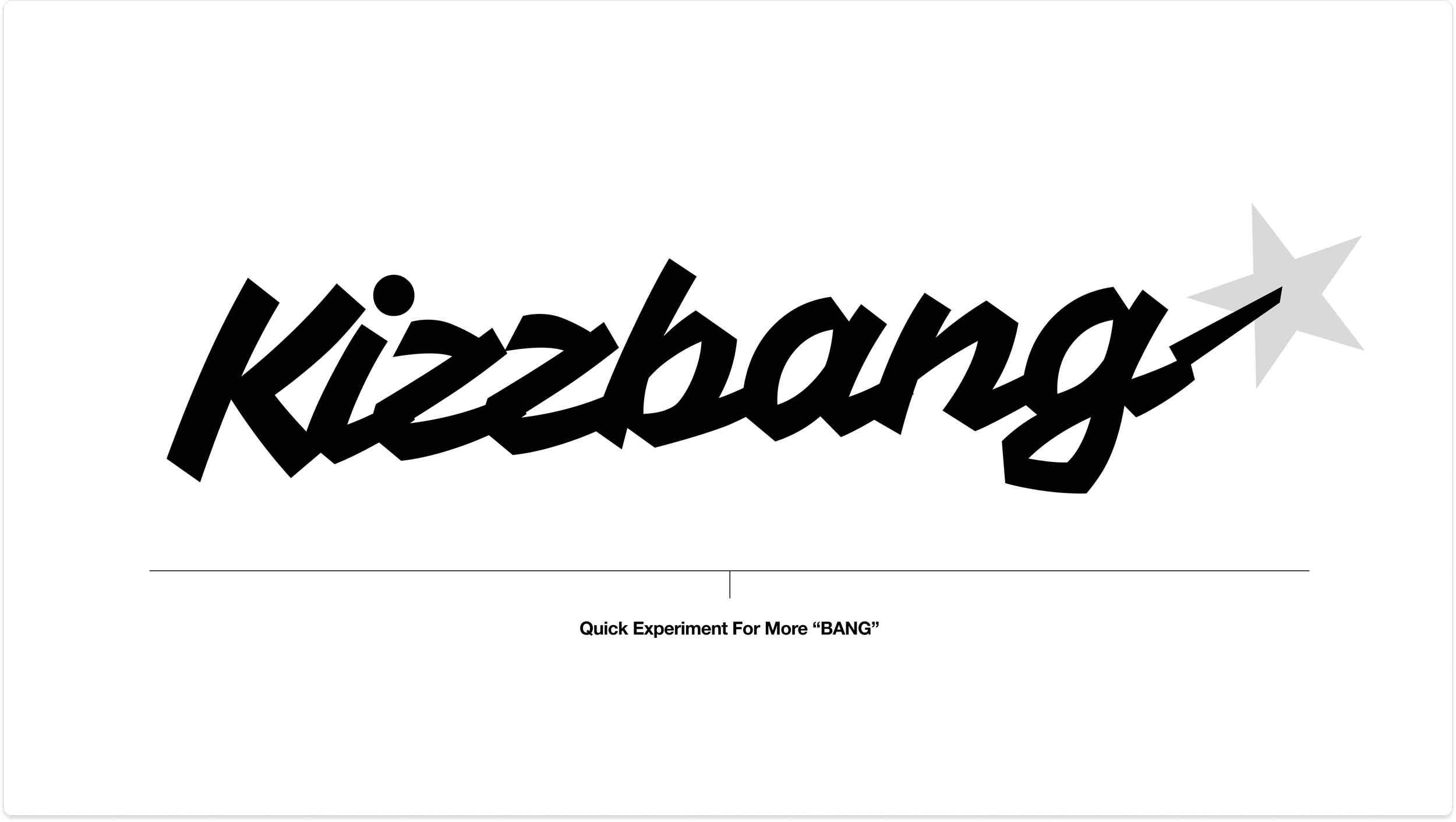
Okay, I know it looks strange right now. Bear with me. To be totally candid, ‘G’s new exit stroke did, at first, look like a firearm to me ( and then when you pair it with ‘bang’, you know… ).
However, I am an American who watches the news regularly. I don’t wish to accidentally promote or glorify guns with this project, especially when you take into consideration the potential audience. So, let’s find a safer way to add more ‘bang’.
To me, this new shape also looks like a boot spur. So, I Google Image searched boot spurs to get a visual reference.

I added more points to the star to match what I was seeing in the references. I also decided now was a good time to start sampling from our RANDOM color palette.

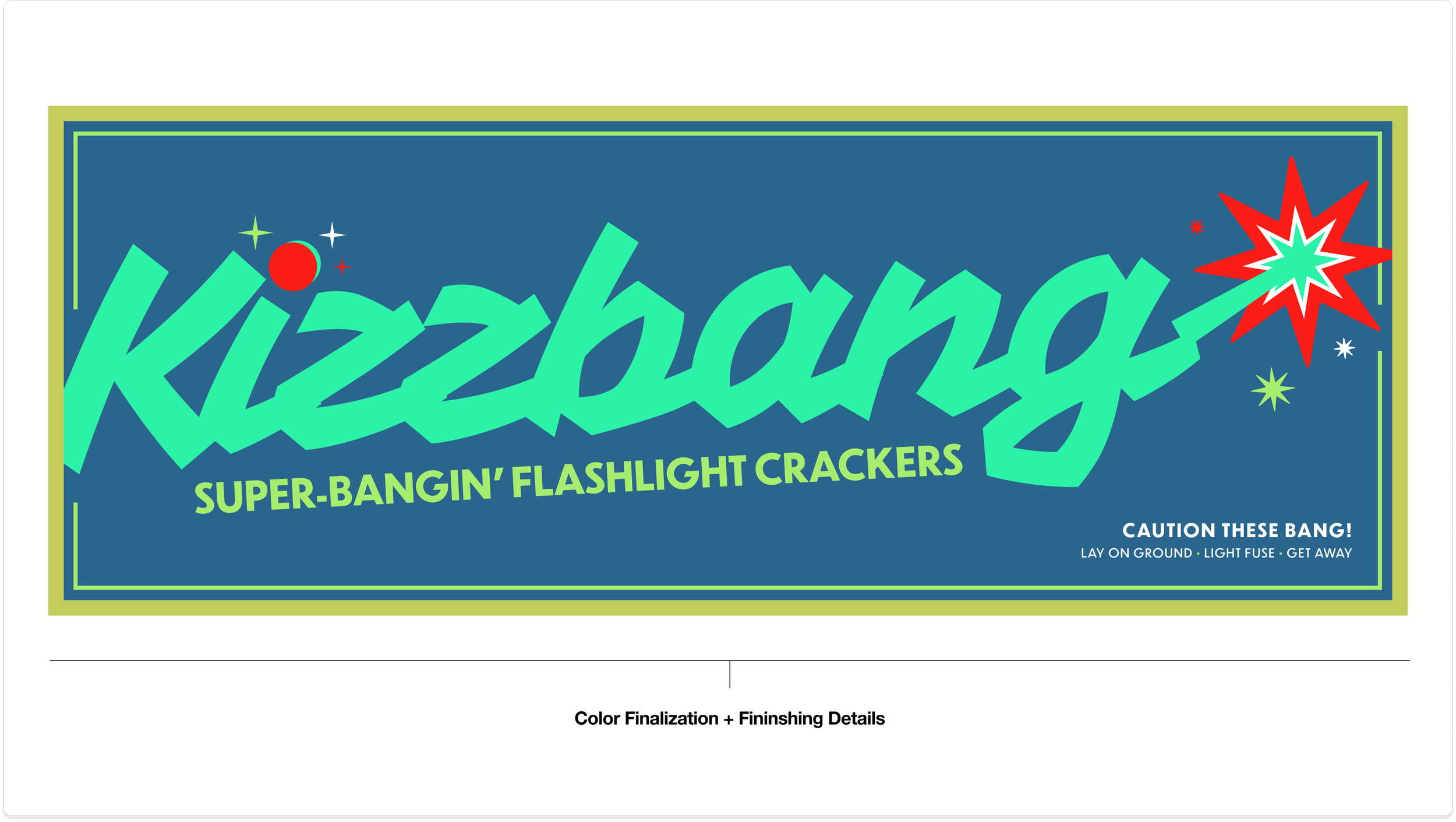
The introduction of color has added more life. Now, I move forward with the goal of creating a composition that incorporates all of the colors from our RANDOM color palette.
Thankfully, because most of the colors have a warm undertone—and are close in shade range—everything seems to work well together.
At some point, I decided that Kizzbang would be a fireworks company. I added “Quality Fireworks” to clarify the message.

As I was working, I couldn’t get the image of L. Frank Baum’s Wizard of OZ 1st edition book covers out of my head. When you see the RANDOM colors together, the palette is reminiscent of the muted Victorian Era hues that were popular at the time.

I wanted to push the vintage vibes of our project further so I took to Google Image again to search for vintage firework packaging.

Can I take a brief moment to talk about these vintage Japanese Firework Illustrations?! Wow…
Yokohama’s public library made the entire catalog available for free download. I snapped up that book faster than if our brand’s name had been KizzZap! [ Article link ]

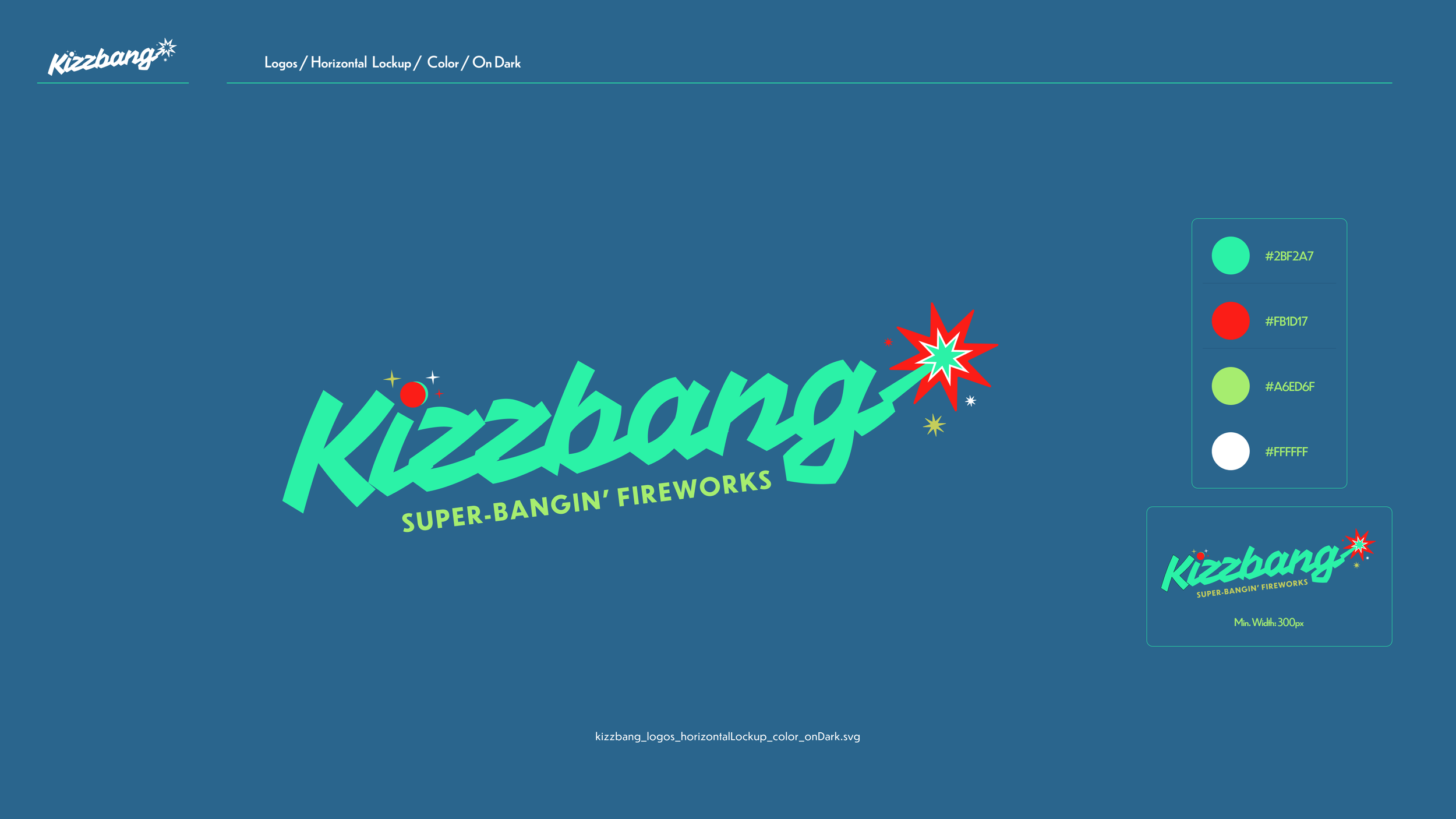
Okay, here’s a final proof for our Kizzbang composition, incorporating the entire color palette and vintage firework packaging references.
I changed the background to the dark blue to mimic a night sky and added a few more graphic elements.
Now, the ‘I’ on the left is the lit fuse with sparks to support the “kizzzzzzzzz…” and, as you move to the right, you eventually get the “BANG” and the stars of the resulting fireworks. Make sense?
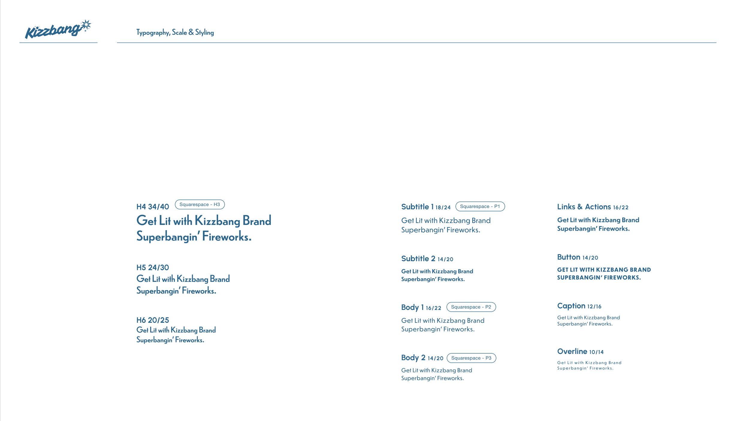
5. Brand Guidelines
Now let’s take everything—the colors, the fonts, the attributes, the logo… all of it—and build guidelines that formally document our existing design decisions and house a starter set of assets that can be used for future designs.
As you’re building, you want to avoid creating totally new design directions. Rather, choose to follow the rules you previously set and use the assets you already have as your main source of reference.
Ultimately, you want to be making more intuitive decisions as you approach book completion. When I start feeling the “No, the brand would never do that” and “Yes, this seems in line with past design decisions” hunches, I know a book construction is going well.
Guidelines are living documents and always evolving. If Kizzbang were a real company, our guidelines six months from now might look very different from the starter set of guidelines we have below.
No matter what growth stage your business is in, you will always make quicker, more confident design decisions when you have a solid set of guidelines available to use as reference.


6. Final Thoughts
I can say with confidence that I would have NEVER thought of Kizzbang on my own. I’m so glad that I decided to attempt creating a totally random brand using RANDOM.ORG.
I hope you enjoyed this journey. Maybe I should try making another random brand in the future. I wonder what brands we would end up creating. 🤔